
Key Takeaways
- Skeleton screens provide essential visual placeholders during content loading, offering a smoother, less disruptive user experience.
- The most effective skeleton screens closely resemble the final layout of your app’s content to minimize confusion and build trust.
- Subtle, non-intrusive animations signal progress without drawing attention away from the rest of the interface.
- Design and implementation consistency are key to making skeleton screens feel like a seamless part of your app rather than a distraction.
Table of Contents
- Understanding Skeleton Screens
- Benefits of Skeleton Screens
- Designing Effective Skeleton Screens
- Common Mistakes to Avoid
- Implementing Skeleton Screens in Your App
- Conclusion
In the fast-paced world of mobile applications, delivering a seamless user experience is crucial to retaining users and building app loyalty. One often-overlooked aspect that significantly affects how an app feels is the approach to managing loading times. Recently, app skeleton screen UI patterns have gained popularity as a way to enhance perceived performance, keep users engaged, and reduce frustration while content loads. Skeleton screens mimic page structure to guide users and create a smoother transition, helping users anticipate content and reducing boredom and anxiety during waits. Unlike spinners, they offer a modern, visually appealing way to manage short delays. Proper design and implementation, following industry best practices such as layout fidelity, subtle animation, and accessibility, ensure they add value without cluttering. This guide covers the psychology of perceived speed, design tips, common mistakes, and development strategies to keep users engaged and minimize abandonment during delays.
Understanding Skeleton Screens
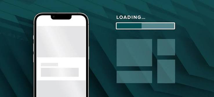
Skeleton screens are user interface placeholders that mimic the structural outline of content while it loads. The idea is simple: rather than showing a blank screen or a generic spinner, a skeleton screen suggests the positions and sizes of future components, such as text boxes, buttons, or images. According to the Nielsen Norman Group, this technique reduces perceived waiting time, comforts users, and prevents frustration by managing attention and expectation.
Typically styled with neutral colors, subtle animations, or shimmer effects, skeleton screens provide just enough information for users to understand what kind of content is forthcoming. This approach is especially effective in data-driven or media-rich apps, where elements like headlines, thumbnails, and list items can be previewed as grey boxes or lines until content arrives.
Benefits of Skeleton Screens
- Enhanced Perceived Performance: Skeleton screens create the illusion of faster load times by immediately providing visual feedback to users, reducing the cognitive cost of waiting.
- Reduced User Anxiety: By structuring the loading experience, users know what is coming and when, fostering patience and reducing the risk of annoyance or exit during slow or intermittent network conditions.
- Improved User Engagement: Keeping users visually engaged throughout the load sequence reduces drop-off and increases overall satisfaction, as users are less likely to abandon the app during unavoidable delays.
Designing Effective Skeleton Screens
Success with skeleton screens hinges on close adherence to real UI layouts, subtle visual effects, and a seamless fit within the application’s broader design system. Here are the industry-approved best practices for optimal results:
Match the Final Layout
A skeleton loader should mirror the shape and placement of core content elements as closely as possible. Generic or mismatched skeletons can mislead users, as their expectations will not align with the final state of the loaded content. For instance, avoid using large rectangular blocks for areas that will eventually become round profile pictures or differently sized paragraph text. Close alignment minimizes cognitive disruption during the transition to the live interface.
Use Subtle Animations
Light, non-distracting animations such as shimmer or fade-in effects indicate that the app is actively working behind the scenes without becoming a visual burden. Overly busy movements or flashy transitions should be avoided as they can cause discomfort and dilute the effectiveness of the skeleton UI. Research suggests that motion should remain secondary to structure, simply reinforcing that progress is being made rather than entertaining.
Maintain Design Consistency
Ensure the skeleton screens comply with established brand elements, including color palettes, rounded corners, and typography treatments. This keeps the interim loading state in line with your product experience. Consistency across loading states and the fully loaded UI builds brand confidence and reduces jarring context shifts, as noted in this UX Design Institute article.
Optimize for Performance
Since skeleton screens primarily mask latency, they should not introduce performance overhead. Design simple, lightweight components that render quickly, using CSS, SVG, or lightweight graphics rather than complex images or heavy assets.
Common Mistakes to Avoid
- Inaccurate Layout Representation: Skeleton loaders that fail to represent the eventual content size or shape mislead users and break trust when content appears unexpectedly.
- Overuse of Animations: Extravagant or distracting animations turn a utility feature into a UX hindrance, detracting from the primary purpose of keeping users informed and reassured.
- Neglecting Accessibility: Skeleton screens must be accessible, accommodate screen readers, follow proper HTML structure, and meet color contrast standards to serve all users, including those with impairments, effectively.
Implementing Skeleton Screens in Your App
- Analyze Content Structure: Map out key interface elements and page layouts, identifying which zones require skeletal placeholders and how they translate from wireframe to functional UI.
- Design Placeholder Elements: Construct visually representative dummy content boxes for every major UI item (such as headlines, buttons, thumbnails, and icons).
- Incorporate Animations: Add animations sparingly and purposefully. Shimmer effects or simple fades provide enough feedback without overwhelming the screen.
- Test and Iterate: Perform user testing to evaluate whether your skeleton screens clarify or confuse, and refine the visual hierarchy and structural alignment based on real interactions and feedback.
Conclusion
Skeleton screens deliver a meaningful improvement to application user experience by structuring the interim between request and response into a familiar, well-defined transition. They harness psychology and design efficiency to keep your audience engaged and satisfied during unavoidable moments of waiting. Following best practices, faithfully mirroring final layouts, adding only necessary animation, and maintaining visual consistency not only strengthens your product but also elevates user trust and patience. Avoid common pitfalls and commit to continuous refinement to ensure your skeleton loaders facilitate rather than frustrate.