
A casino platform can have thousands of games and still feel unusable if the lobby is messy. The opposite is also true: a smaller catalog can feel “bigger” when navigation is clean and discovery is fast. If you are evaluating a modern gambling site, the lobby is where you’ll immediately feel whether the product is built for real users or just stuffed with tiles.
Below is a practical breakdown of how this platform’s lobby is structured, what sections it pushes to the front, and what that means for day to day use.
The first impression: everything is a category
Right from the top, the layout is built around big, clear categories rather than trying to force you into one funnel. The primary navigation highlights:
- Sports
- Live (sports live)
- Slots
- Live Casino
- Esports
- A dedicated in-house style section (“wowgames”)
That’s a good sign. When a platform splits “slots” and “live casino” cleanly, it usually means they expect users to switch modes often, not just spin one slot forever. It also reduces the classic problem where live tables are buried under endless slot thumbnails.
Sports: quick access without clutter
The sports area is positioned as a major pillar, not an afterthought. The UI surfaces “Top Sports” shortcuts, which is exactly what most users want. Football, tennis, basketball, ice hockey, volleyball, table tennis, cricket, and more are presented as one-tap entry points.
Below that, “Top Events” is displayed as a horizontal list of event cards. This card layout works well on mobile because it keeps browsing light and visual. The important part here is that the platform is not forcing deep menus immediately. You can scan, then click.
If you care about speed, this approach is better than huge nested trees. The tradeoff is that power users sometimes want more filtering upfront. So the question becomes: does it offer deep filters after you enter a sport? (You should verify this inside the sport view, not on the homepage.)
Slots: tile-first browsing, with familiar titles
The slots section is presented as a classic grid of large thumbnails. The “All Games” button appears near the section header, which suggests the platform expects browsing by category first and full catalog second.
What matters in slot lobbies is not just the number of titles. It’s whether you can:
- Find a game again quickly
- Identify variants (holiday versions, sequels, “Hold and Win” formats)
- Filter by provider, features, volatility, or themes
From the lobby view, it’s clearly optimized for visual discovery. You see recognizable titles in the grid (for example, “Gates of Olympus,” “Coin Craze Jackpot,” and other familiar-looking releases), plus crash-style titles sitting nearby. That blend can be convenient, but it can also confuse users who want a strict separation between slots and fast games. Ideally, filters handle that.
read more:The Growing Importance of Expert Testimony in IP Litigation
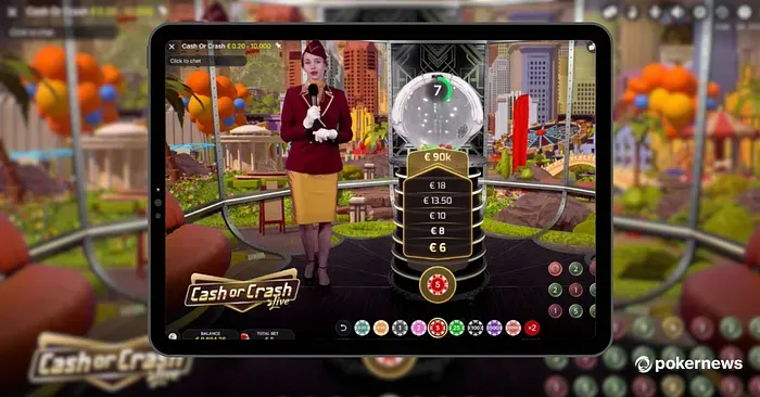
Live Casino: clean table lineup and strong providers
Live Casino is separated and showcased with its own section. You see a grid of table tiles (roulette and blackjack variants are visible), and each tile includes minimum and maximum stakes, which is a big usability win. Nothing is more annoying than entering a table to discover the limits don’t match your budget.
Another useful signal: the platform highlights well-known live providers in the “Casino Providers” area. Evolution appears, which typically indicates a solid live table lineup. Seeing multiple providers also usually means better variety in table styles and languages, not just one repeated blackjack room.
If live tables matter to you, the things to verify next are simple:
- Are there enough tables at low stakes during peak hours?
- Is there a clear lobby filter for language and limits?
- Does the video stream stay stable on mobile data?
“Wowgames” and crash: fast-play is treated as a main product
A lot of casinos bolt crash games onto the side like a gimmick. Here, crash and quick games are surfaced as a primary category (“wowgames”), with a dedicated section and its own “All Games” entry.
This is a deliberate product choice. It tells you they want fast sessions, not only long slot marathons. You’ll see crash-style tiles and quick mechanics (dice-like, multiplier style, and rapid rounds). If you’re the type who wants short sessions with quick decisions, you’ll like that. If you prefer slower pacing, it’s still fine because it’s separated from slots and live.
Search, filters, and the “can I actually find stuff” test
This is the part that separates a usable platform from a frustrating one. On category pages, the left-side filtering panel is visible for browsing batteries in the other screenshot style, but for this casino lobby, what you want to confirm is whether similar filtering exists inside game lists: provider filters, game type, and sorting.
If you cannot filter by provider or quickly search titles, the experience becomes random scrolling. A platform positioned like a modern hub should pass the basics: search bar, provider grouping, and stable categories. The homepage already hints at that structure, and in a review context you’d describe the platform as a “hub style lobby,” which fits the feel of a wowbet online casino without overhyping it.
Promotions: visible, but not forced
Promos are present as their own nav item and also teased in a “Bonuses” strip near the bottom (examples shown include things like insurance-style promos and weekly bonuses). This placement is decent because it’s discoverable but not screaming at you every second.
Still, promos are where users get burned, so be strict about this:
- Check wagering requirements
- Check game contribution rules (slots vs live vs crash often differ)
- Check max cashout clauses
- Check time limits and eligible countries
If a platform makes promos easy to click but hard to understand, that’s not a feature. That’s a trap.
Account and language: standard, but important
The header shows quick access to registration/login, language selection, and what looks like a balance area. This is normal, but the key is whether the site keeps these controls consistent across mobile and desktop. Some platforms hide balance and account controls behind multiple taps on mobile. This one appears to keep them upfront.
Safety and responsible play: what to verify (no excuses)
Even if the UI looks clean, the responsible step is always the same:
- Confirm licensing and operator details in the footer
- Read withdrawal rules and verification requirements (KYC)
- Understand limits, self-exclusion, and responsible gambling tools
- Never deposit more than you can afford to lose
The footer also displays an 18+ marker, which is expected. Treat that as the baseline, not the proof of safety.
Bottom line
As a lobby experience, this platform looks structured around clear pillars: Sports, Slots, Live Casino, crash/quick games, and Esports. That’s the right foundation. The real deciding factors are deeper than the homepage: search quality, filtering on game lists, stability on mobile, table availability at your stake level, and transparent promo and withdrawal rules.
If those pieces check out, the lobby design is doing its job: helping users find what they want fast, without turning the experience into a chaotic scroll-fest.