
Table of Contents
- Why a Kitchen Palette Matters
- Start With Fixed Elements
- Choose a Cabinet Color
- Balance Countertops and Backsplashes
- Use Lighting to Shape the Room
- Mix Materials Without Clutter
- Test Samples Before Buying
- Common Palette Mistakes to Avoid
- Common Questions
- Final Takeaway
A well-planned kitchen palette does more than make a room look polished. It creates a space that feels comfortable to use every day, works with the rest of the home, and remains appealing after short-lived design trends pass.
Whether you are starting a full renovation or updating a few finishes, planning your colors and materials together is essential. Homeowners comparing kitchen cabinets in Salt Lake City can use this approach to make confident decisions about cabinetry, counters, backsplashes, flooring, hardware, and lighting before ordering any major materials.
Why a Kitchen Palette Matters
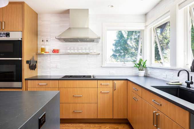
A kitchen contains many large visual surfaces, including cabinets, countertops, floors, walls, appliances, and fixtures. If each item is selected separately, the completed room can feel busy or disconnected. A palette gives every surface a role: a calm background, a supporting material, or a focal point.
Current preferences leave room for personality without requiring an overly dramatic space. The 2026 kitchen trends report notes continued interest in neutrals, greens, blues, wood grain, natural materials, and layered lighting. These directions are useful starting points, but the best kitchen still reflects the household’s habits, architecture, and maintenance needs.
Start With Fixed Elements
Begin with the features that are expensive or difficult to replace. Existing flooring, window trim, appliances, plumbing fixtures, and stone surfaces should influence the rest of the plan. A warm oak floor, for example, may look more natural with creamy white, olive, mushroom, or warm wood cabinets than with a sharply cool blue-gray finish.
A Practical Planning Order
- Identify colors and undertones already present in the room.
- Choose the overall cabinet direction.
- Select the countertop and backsplash as a pair.
- Finish with hardware, lighting, wall paint, and accessories.
This sequence protects the budget. Cabinetry and countertops are major investments, while paint, pulls, and pendants are generally easier to adjust later.
Choose a Cabinet Color
Cabinets usually occupy the most visual space, so their color should set the tone. Warm white and pale natural wood can make a compact kitchen feel open. Muted green, dusty blue, medium brown, and soft charcoal can bring depth and character without overwhelming the room. Deep colors work especially well when they are balanced by generous daylight, light countertops, or reflective backsplash materials.
Questions to Ask Before Committing
- Does the kitchen receive warm sunlight, cool northern light, or very little natural light?
- Will the finish still look appealing in the evening?
- Does the color connect with nearby living areas?
- Will fingerprints, dust, water spots, or cooking splatters be noticeable?
A trend can spark ideas, but comfort should guide the final choice. If a color feels too bold on every cabinet, consider using it on the island, pantry wall, or open shelving instead.
Balance Countertops and Backsplashes
Countertops and backsplashes should work together rather than compete. If the countertop has strong veining, movement, or multiple colors, a simple tile or slab backsplash usually provides the needed visual rest. If the counter is quiet and solid, the backsplash can introduce handmade texture, a subtle pattern, or a more noticeable accent color.
Simple Pairing Rules
- Choose one dominant pattern and let the other major surface stay quieter.
- Repeat at least one undertone or color between the counter and backsplash.
- Compare samples in person, not only by product names or online photos.
- Step back several feet to judge the pattern scale across the whole room.
Natural stone, engineered surfaces, tile, and wood all vary in appearance and upkeep. Consider how often the kitchen is used, how comfortable you are with sealing or polishing, and whether natural variation feels appealing or distracting.
Use Lighting to Shape the Room
Lighting can change the apparent color of nearly every finish. Warm bulbs can make white paint look creamier, while cooler light may bring out gray or blue undertones. Understanding color temperature helps explain why a sample that looks perfect in daylight can appear too yellow, dull, or stark after sunset.
Build Lighting in Layers
- Ambient lighting: Provides overall brightness for the room.
- Task lighting: Illuminates counters, sinks, and cooking areas.
- Accent lighting: Highlights shelves, art, texture, or architectural details.
- Under-cabinet lighting: Reduces shadows on work surfaces and brightens the backsplash.
Test finishes under the actual bulbs you plan to use. Good task lighting improves daily function, while dimmable ambient lighting helps the kitchen transition from food preparation to entertaining.
Mix Materials Without Clutter
Material contrast creates a layered kitchen, but too many competing finishes can create visual clutter. A simple three-part approach keeps the composition controlled: choose a base material, add a supporting material, and include one intentional accent.
- Base: Painted cabinets, natural wood, or a neutral cabinet finish.
- Support: Countertops, flooring, or backsplash that complement the base.
- Accent: Hardware, pendants, a contrasting island, or a small area of open shelving.
Texture is especially helpful because it adds interest without demanding more color. Smooth cabinetry, lightly veined stone, ribbed glass, and a woven runner can feel warm and collected while staying within a restrained palette.
Test Samples Before Buying
Do not approve a major finish from a tiny swatch alone. Gather cabinet, counter, backsplash, flooring, hardware, and paint samples, then place them beside one another in the actual kitchen. View the arrangement in the morning, afternoon, and evening. Move samples near windows, under overhead fixtures, and beneath under-cabinet lighting.
Keep the samples visible for several days and take unfiltered photos from across the room. Larger samples reveal pattern scale, sheen, and color variation far better than a small chip.
Common Palette Mistakes to Avoid
- Selecting every finish from one showroom display without testing it at home.
- Using several bold patterns on cabinets, counters, backsplash, and flooring.
- Ignoring bulb color and the kitchen’s natural light.
- Choosing paint or stone from a screen rather than a physical sample.
- Forgetting that the kitchen should connect with adjacent rooms.
- Using dark finishes in a low-light kitchen without enough contrast or task lighting.
Common Questions
How Many Colors Should a Kitchen Have?
Two or three primary colors are usually enough. Natural wood, stone, metal, and texture can add depth without introducing additional competing shades.
Should the Island Match the Other Cabinets?
Matching cabinets create a calm, unified look. A contrasting island creates a focal point. Either choice can work when shared hardware, countertop material, or undertones connect the island to the rest of the room.
How Can a Small Kitchen Feel More Open?
Use a limited palette, gentle contrast, effective task lighting, and light-reflecting surfaces in selected areas. Avoid placing strong patterns on every major surface, since visual simplicity helps a compact kitchen feel more spacious.
Final Takeaway
A successful kitchen palette is built on balance, not rigid rules. Start with fixed elements, select cabinets as the visual anchor, coordinate counters and backsplashes, and test every finish in real light. When personal taste, daily function, and material maintenance are considered together, the finished kitchen will feel cohesive for years to come.
